# import tidyverse library
library(tidyverse)

# read the CSV with WVS data
wvs_cleaned <- read_csv("data-output/wvs_cleaned_v1.csv")

# Convert categorical variables to factors
columns_to_convert <- c("country", "sex", "marital_status", "urban_rural", "income_level", "education", "trust_people")

wvs_cleaned <- wvs_cleaned |>
    mutate(across(all_of(columns_to_convert), as_factor))

# peek at the data, pay attention to the data types!
glimpse(wvs_cleaned)Session 3: Data Visualization and Descriptive Stats
Bella Ratmelia & Wei Xia
Today’s Outline
- Univariate descriptive stats and visualization
- for continuous variable
- for categorical variable (frequency or proportion)
- Bivariate (two variables) descriptive stats and visualization
- both categorical
- both continuous (+ correlation plot)
- one categorical, one continuous
- Using Facets
- Best practices
- Recap + Quiz!
Checklist when you start RStudio
Go to the folder where you put your project for this workshop
Find a file with
.Rprojextension - this is the R project file that holds all the information about your project.
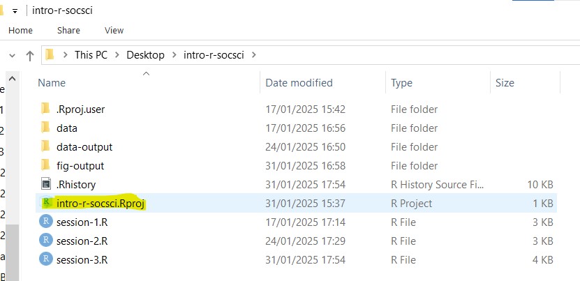
- Double click on the file. Rstudio should launch with your project loaded!
Optional (Though best practice):
- Make sure that
Environmentpanel is empty (click on broom icon to clean it up). - Clear the
ConsoleandPlotstoo.
Refresher: Loading from CSV into a dataframe
Use read_csv from readr package (part of tidyverse) to load our data into a dataframe
Recap: Descriptive Statistics
Univariate (i.e. single variable) Descriptive Stats
- Measures of central tendency:
mean(),median(),Mode() - Measures of Variability:
min(),max(),range(),IQR(),sd()(standard deviation),var()(variance) - Distribution shape:
skewness()andkurtosis()frommomentslibrary. This is easier to see with histogram
- Measures of central tendency:
Bivariate (i.e. two variables) Descriptive Stats
- Contingency table / cross tab (for categorical data)
- Covariance - describe how two variables vary together
- Correlation - describe relationship strength and direction in a sample. (If we want to use this to infer about a population from a sample, it would fall under inferential stats)
- Visualizations e.g. Scatterplots, side-by-side boxplots, stacked bar charts, etc.
Recap: Basic R Functions for Descriptive Stats
Last week, we explored some basic R functions for descriptive statistics.
mean(): arithmetic averagemedian(): middle valuesd(): standard deviationvar(): variancerange(): range of valuesIQR(): interquartile rangesummary(): provides a summary of descriptive statisticsMode()function fromDescToolspackage: the most frequently occuring value 1
Recap: Long vs Wide Data
Long data:
Each row is a unique observation.
There is a separate column indicating the variable or type of measurements
This format is more “understandable” by R, more suitable for visualizations (which we’ll explore more next week!)
Wide data:
Each row is a value in variables.
Each column is a value in variables –> the more values you have, the “wider” is the data
This format is more intuitive for humans!
Long vs Wide Data: Examples
Long data:
| country | age_group | count |
|---|---|---|
| Turkey | 18-28 | 329 |
| Turkey | 29-44 | 427 |
| Turkey | 45-60 | 430 |
| Turkey | 61+ | 30 |
| Hong Kong SAR | 18-28 | 191 |
| Hong Kong SAR | 29-44 | 384 |
| Hong Kong SAR | 45-60 | 412 |
| Hong Kong SAR | 61+ | 285 |
| Indonesia | 18-28 | 308 |
| Indonesia | 29-44 | 529 |
| Indonesia | 45-60 | 360 |
| Indonesia | 61+ | 104 |
| Malaysia | 18-28 | 379 |
| Malaysia | 29-44 | 511 |
| Malaysia | 45-60 | 349 |
| Malaysia | 61+ | 74 |
Wide data:
| country | 18-28 | 29-44 | 45-60 | 61+ |
|---|---|---|---|---|
| Turkey | 329 | 427 | 430 | 30 |
| Hong Kong SAR | 191 | 384 | 412 | 285 |
| Indonesia | 308 | 529 | 360 | 104 |
| Malaysia | 379 | 511 | 349 | 74 |
Long vs Wide Data: One way to spot
Pay attention to the columns of the data. 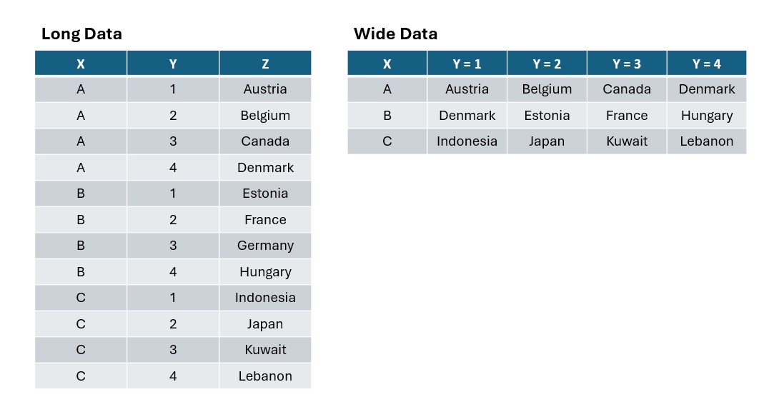
Univariate Descriptive Stats + Visualization
Measures of Central Tendency
Let’s start by examining the age variable in our dataset.
library(DescTools)
# if you get an error, install the library first with this code:
# install.packages("DescTools")

# Basic statistics
mean_age <- mean(wvs_cleaned$age, na.rm = TRUE)
median_age <- median(wvs_cleaned$age, na.rm = TRUE)
mode_age <- DescTools::Mode(wvs_cleaned$age, na.rm = TRUE)

# Print results
cat("Mean age:", mean_age, "\n") # cat stands for concatenate
Mean age: 41.05292 Median age: 39 Most frequently occuring age: 55 How we can interpret / report this:
“The average age of respondents in this sample is 41.05 years (mean), with a median of 39 years. The mean being slightly higher than the median suggests a mild right skew in the age distribution, i.e. there are some older respondents pulling the average upward. The most frequently occurring age is 55 years, indicating a notable cluster of participants in their mid-50s.”
Measures of Variability or Dispersion
Variance of age: 205.059 Standard deviation of age: 14.31988 Range of age: 18 to 95 Interquartile range of age: 23 between: 29 52How we can interpret / report this:
“The age distribution of this sample is fairly wide spread. With a standard deviation of 14.31988, suggesting that most individuals’ ages deviate from the mean by approximately 14.32 years. The range of ages spans from 18 to 95 years, which covers a wide range of age groups within the sample. The IQR, which represents the middle 50% of respondents, fall within a 23-year band (roughly ages 29 to 52)”
Distribution Shape
The function skewness() and kurtosis() is available through R package called moments. You may need to install it first before calling the library and its functions like in this code below.
Skewness of age: 0.4270082 Kurtosis of age: 2.492457 How we can interpret / report this:
“The age distribution shows a mild positive skew (skewness = 0.43), indicating a slight lean toward younger ages with some older respondents pulling the mean (41.05 years) above the median (39 years). The skew is modest enough to be considered approximately symmetric. The kurtosis of 2.49 is slightly below the normal distribution benchmark of 3, indicating a platykurtic distribution, i.e. ages are somewhat more evenly spread rather than sharply peaked around the mean.”
Visualizing with ggplot - Histogram
Describing the spread and shape of distribution with just words is not very productive, so typically it is accompanied with visualization.
ggplotis plotting package that is included insidetidyversepackageworks best with data in the long format, i.e., a column for all the dimensions/measures and another column for the value for each dimension/measure.
Visualizing with ggplot - Histogram
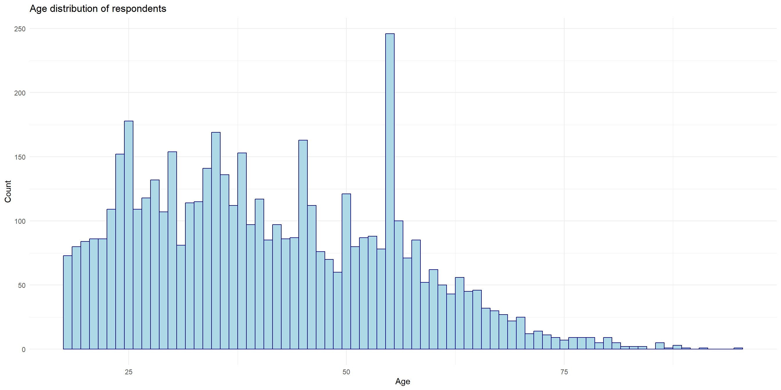
Anatomy of ggplot code
Charts built with ggplot must include the following:
- 1
- Data - the dataframe/tibble to visualize.
- 2
- Aesthetic mappings (aes) - describes which variables are mapped to the x, y axes, alpha (transparency) and other visual aesthetics.
- 3
- Geometric objects (geom) - describes how values are rendered; as bars, scatterplot, lines, etc.
- 4
- Provide titles and labels to your graph
- 5
- (Optional) apply a theme/look to your graph
Tip: open the ggplot cheatsheet
Tip
A strategy I’d like to recommend: briefly read over the ggplot2 documentation and have them open on a separate tab. Figure out the type of variables you need to visualize (discrete or continuous) to quickly identify which visualization would make sense.
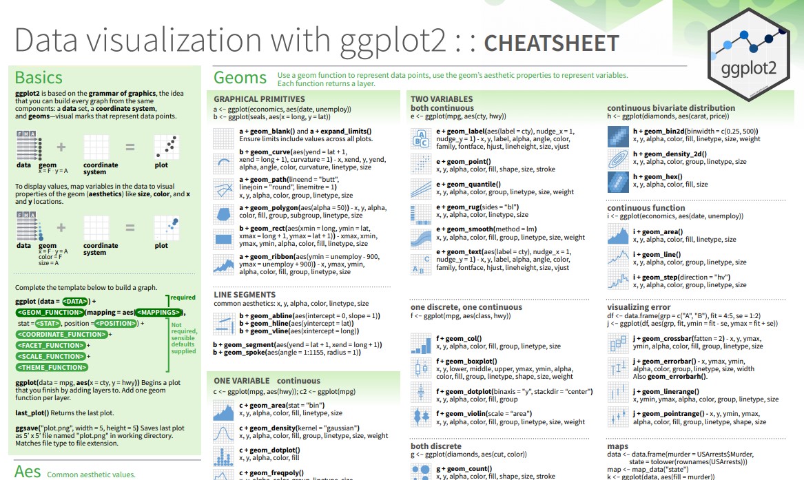
Continuous Data - Boxplot
Let’s visualize the variability with boxplot to get a better sense of the spread.
Continuous Data - Boxplot
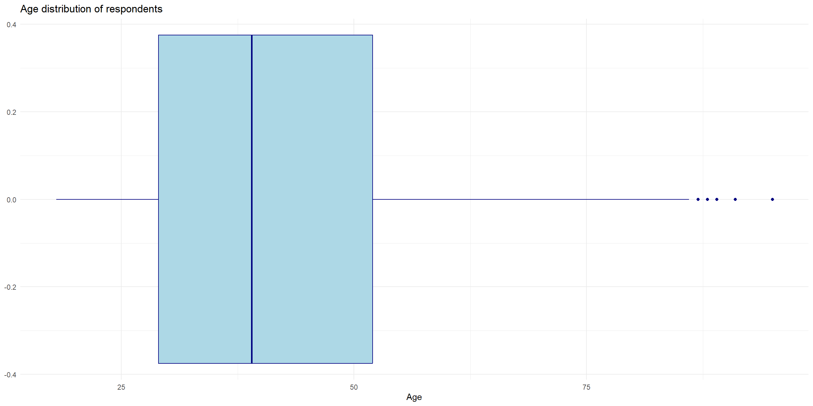
Categorical Data - Bar chart for frequency distribution
The
agevariable is a numerical / continuous data. We can’t applymean(),median()and other central tendency measures to categorical data such asage_grouporemployment_status. We can, however, visualize them.When dealing with categorical data, first take note on whether you want to visualize the proportion or the frequency distribution.
Let’s visualize the frequency distribution of survey participants by
country:
Categorical Data - Bar chart for frequency distribution
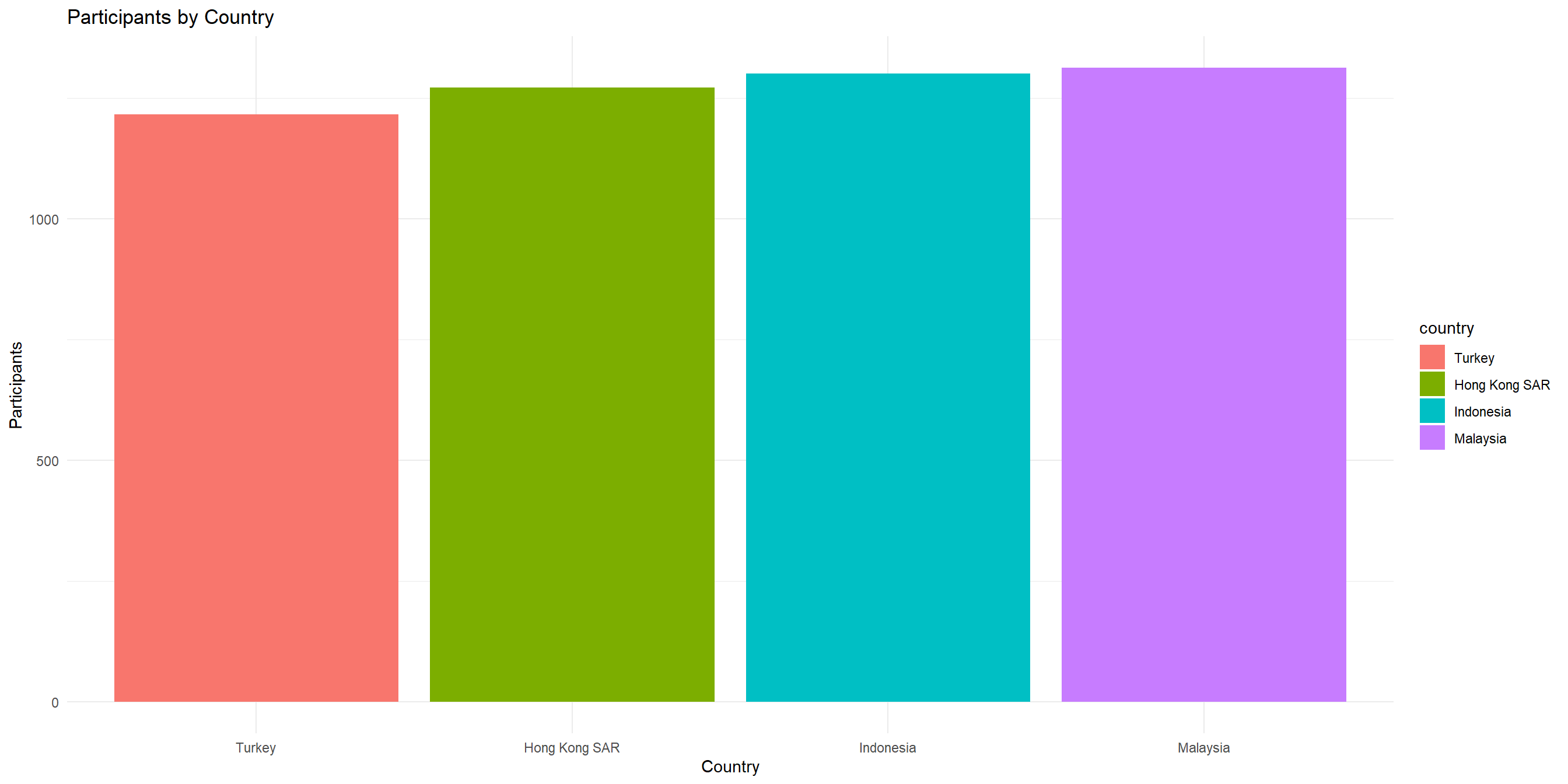
Categorical Data - Pie chart for proportion
When we want to show proportion (i.e. in terms of “parts of whole”), we must first quickly calculate the proportion with count()
Let’s create a new dataframe called wvs_country_proportion to hold this data.
# A tibble: 4 × 3
  country           n proportion
  <fct>         <int>      <dbl>
1 Turkey         1216      0.238
2 Hong Kong SAR  1272      0.249
3 Indonesia      1301      0.255
4 Malaysia       1313      0.257
Categorical Data - Pie chart for proportion
And then, we use this proportion table to create a pie chart by adding coord_polar() layer after geom_bar() and some changes in aes() and geom_bar()
Categorical Data - Pie chart for proportion
Learning Check - Grammar of Graphics
Using the wvs_cleaned dataset:
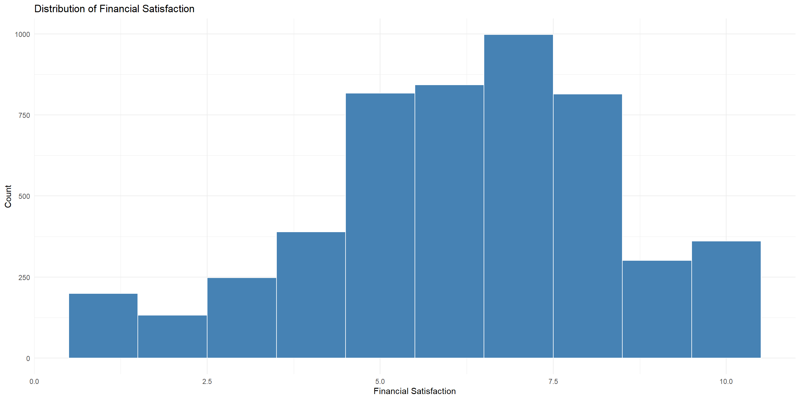
Create a histogram that visualizes the distribution of financial_satisfaction
Learning Check - Grammar of Graphics
Bivariate Descriptive Stats + Visualization
Three Combinations in Bivariate Descriptive Stats
Bivariate descriptive statistics describe and summarize relationships between two variables in your dataset without making inferences about a larger population. They include numeric measures like correlation or covariance, and visualizations like scatterplots, side-by-side boxplots, or contingency tables.
Think of them as taking a snapshot of how two variables relate to each other in your current data.
Since data can be continuous or categorical, there can be three combinations when we deal with bivariate descriptive stats:
- Both categorical (e.g.
age_groupandcountry) - Both continuous (e.g.
financial_satisfactionandlife_satisfaction) - One continuous, one categorical (e.g.
countryandlife_satisfaction)
Both categorical
Examine relationships between categorical variables
Look at joint distributions and proportions
Compare group compositions
First, let’s create a contingency table of age_group and country!
Both categorical - Proportion table
We can also create a proportion table just like we did earlier
# A tibble: 16 × 4
# Groups:   country [4]
   country       age_group     n   prop
   <fct>         <chr>     <int>  <dbl>
 1 Turkey        18-28       329 0.271
 2 Turkey        29-44       427 0.351
 3 Turkey        45-60       430 0.354
 4 Turkey        61+          30 0.0247
 5 Hong Kong SAR 18-28       191 0.150
 6 Hong Kong SAR 29-44       384 0.302
 7 Hong Kong SAR 45-60       412 0.324
 8 Hong Kong SAR 61+         285 0.224
 9 Indonesia     18-28       308 0.237
10 Indonesia     29-44       529 0.407
11 Indonesia     45-60       360 0.277
12 Indonesia     61+         104 0.0799
13 Malaysia      18-28       379 0.289
14 Malaysia      29-44       511 0.389
15 Malaysia      45-60       349 0.266
16 Malaysia      61+          74 0.0564
Both categorical - Bar chart
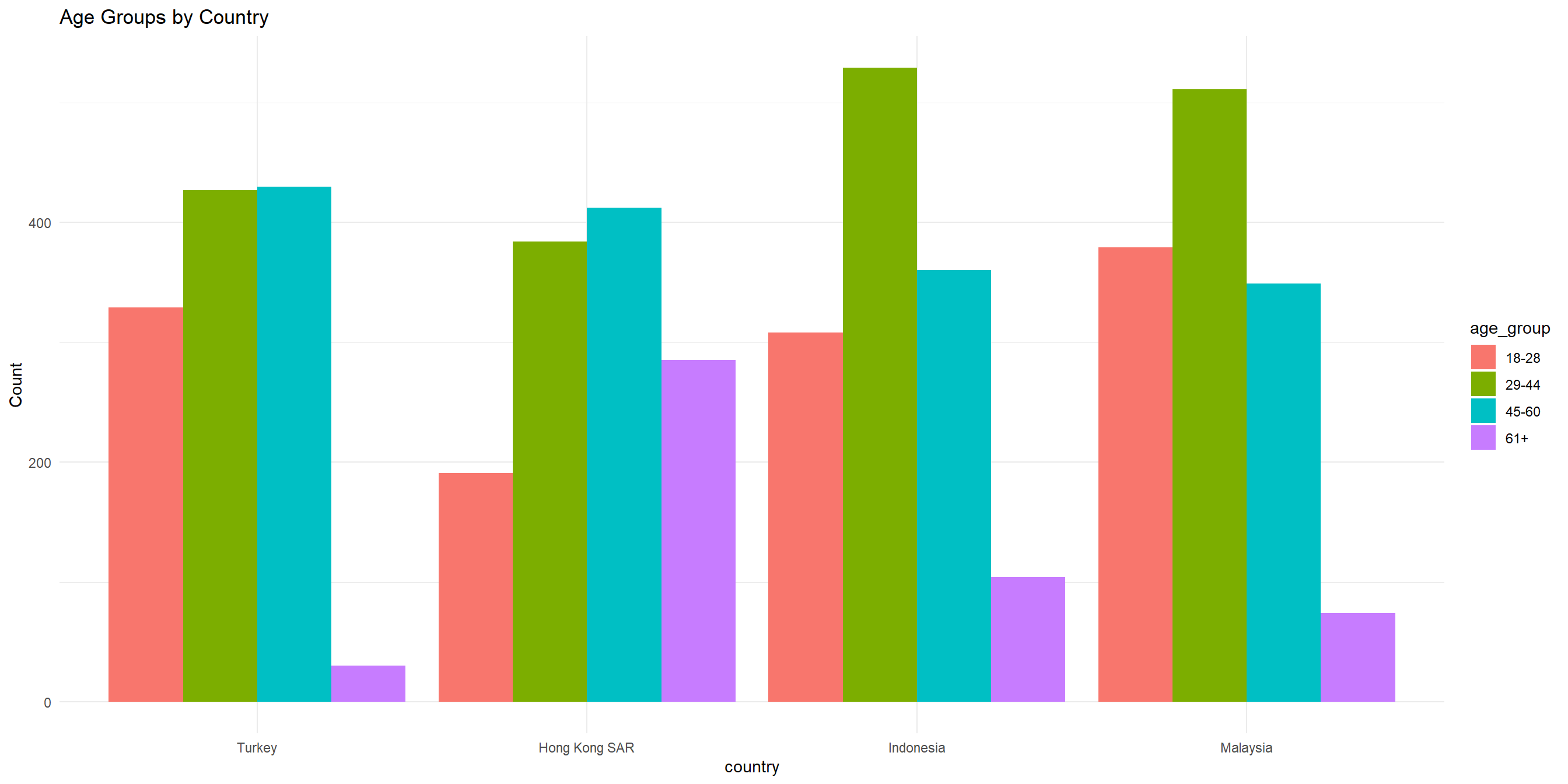
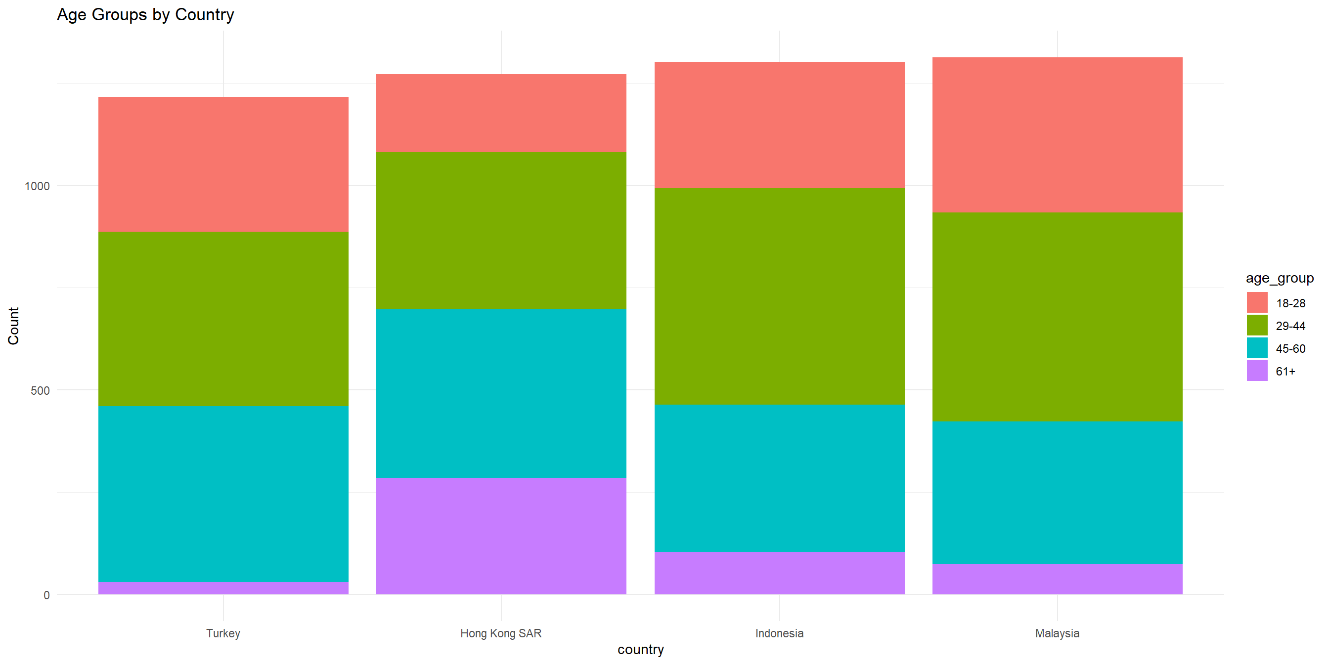
For categorical data like this, we can use barchart to visualize the frequency distribution. Stacked bar chart can be used to visualize proportion.
Both categorical - Bar chart
Both categorical - Stacked bar chart
Change position = "dodge" to position = "stack" to stack the bar chart
Both categorical - Stacked bar chart
Both categorical - Percent-stacked bar chart
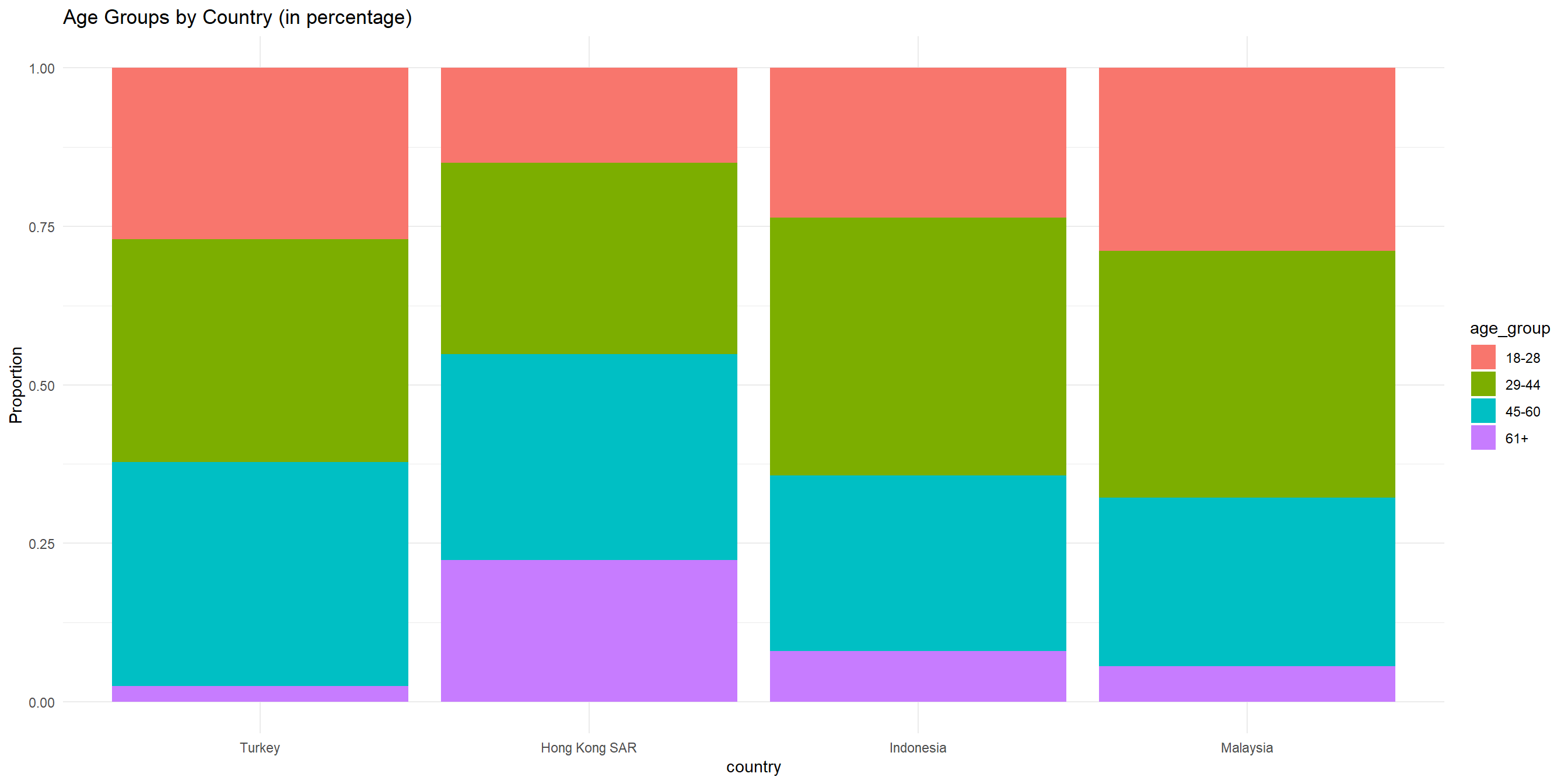
To get a better sense of the proportion for each country, we can use percent stacked bar chart.
The code is similar to previous bar charts; we just have to change the position argument to position = "fill"
Both categorical - Percent-stacked bar chart
Both continuous
Examine linear relationships
Look for patterns and trends
Identify potential outliers
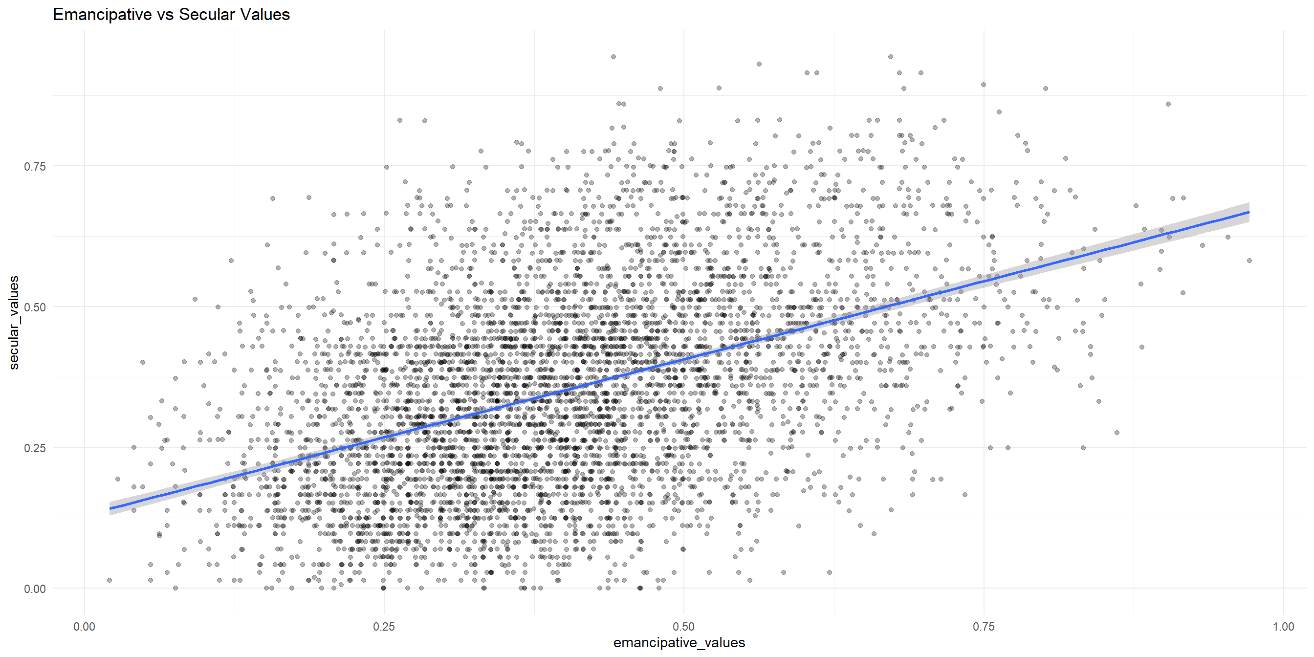
Let’s first examine the correlation between emancipative_values and secular_values
Both continuous - Jitter / scatterplot
Let’s visualize the two variables together with a jitter / scatterplot!
Both continuous - Jitter / scatterplot
One continuous, one categorical - Summary table
Compare distributions across groups
Identify group differences
Examine spread within groups
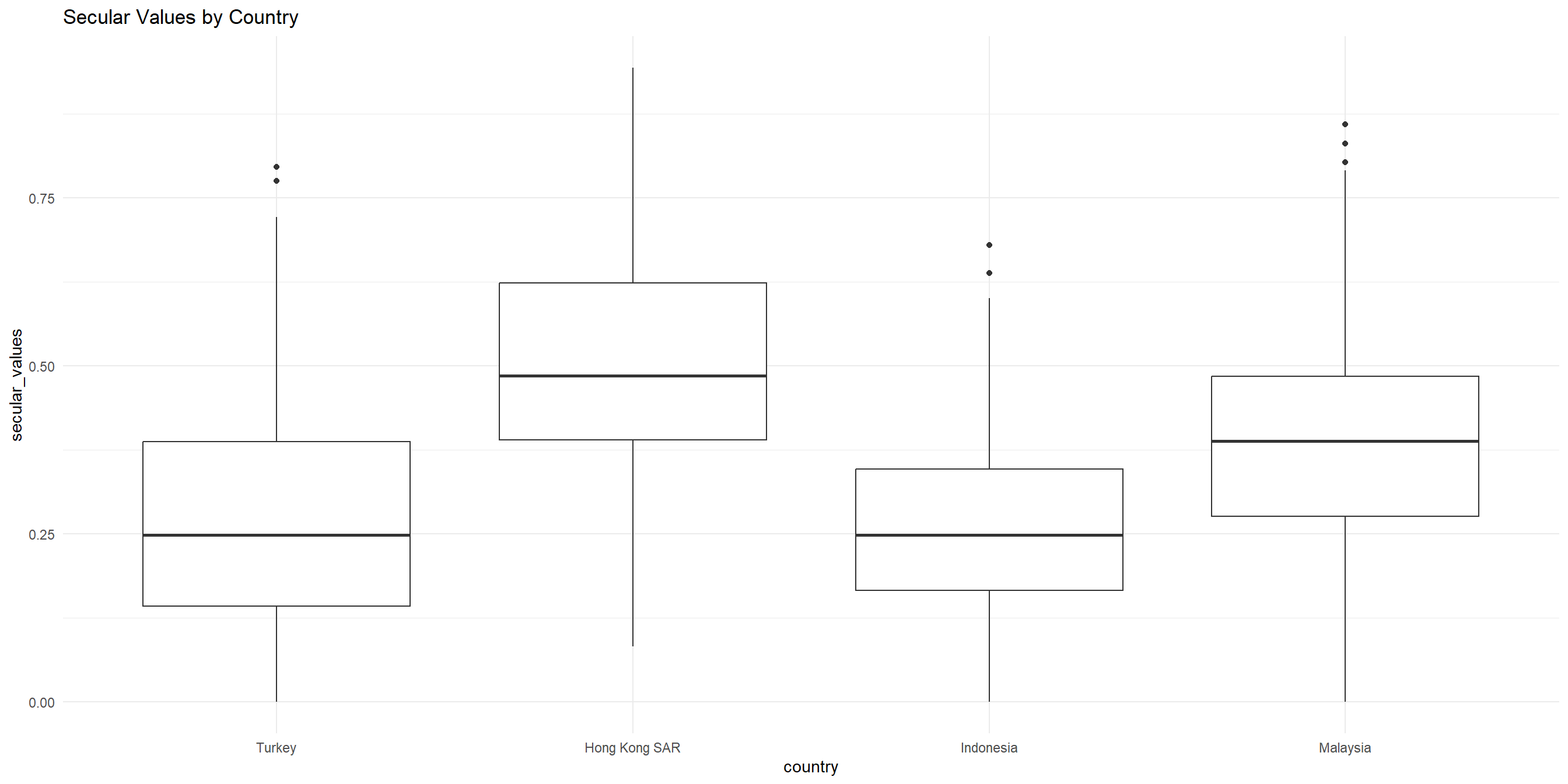
Let’s do a recap from last week and get the summary stats for secular_values for each country
# A tibble: 4 × 4
  country       mean_secular median_secular sd_secular
  <fct>                <dbl>          <dbl>      <dbl>
1 Turkey               0.270          0.248      0.158
2 Hong Kong SAR        0.503          0.485      0.159
3 Indonesia            0.256          0.249      0.123
4 Malaysia             0.382          0.388      0.162
One continuous, one categorical - Boxplots
To get a better sense of how the data is varied and spread, let’s visualize them with a side-by-side boxplot
One continuous, one categorical - Boxplots
One continuous, one categorical (cont’d) - Layered boxplots and violin plots
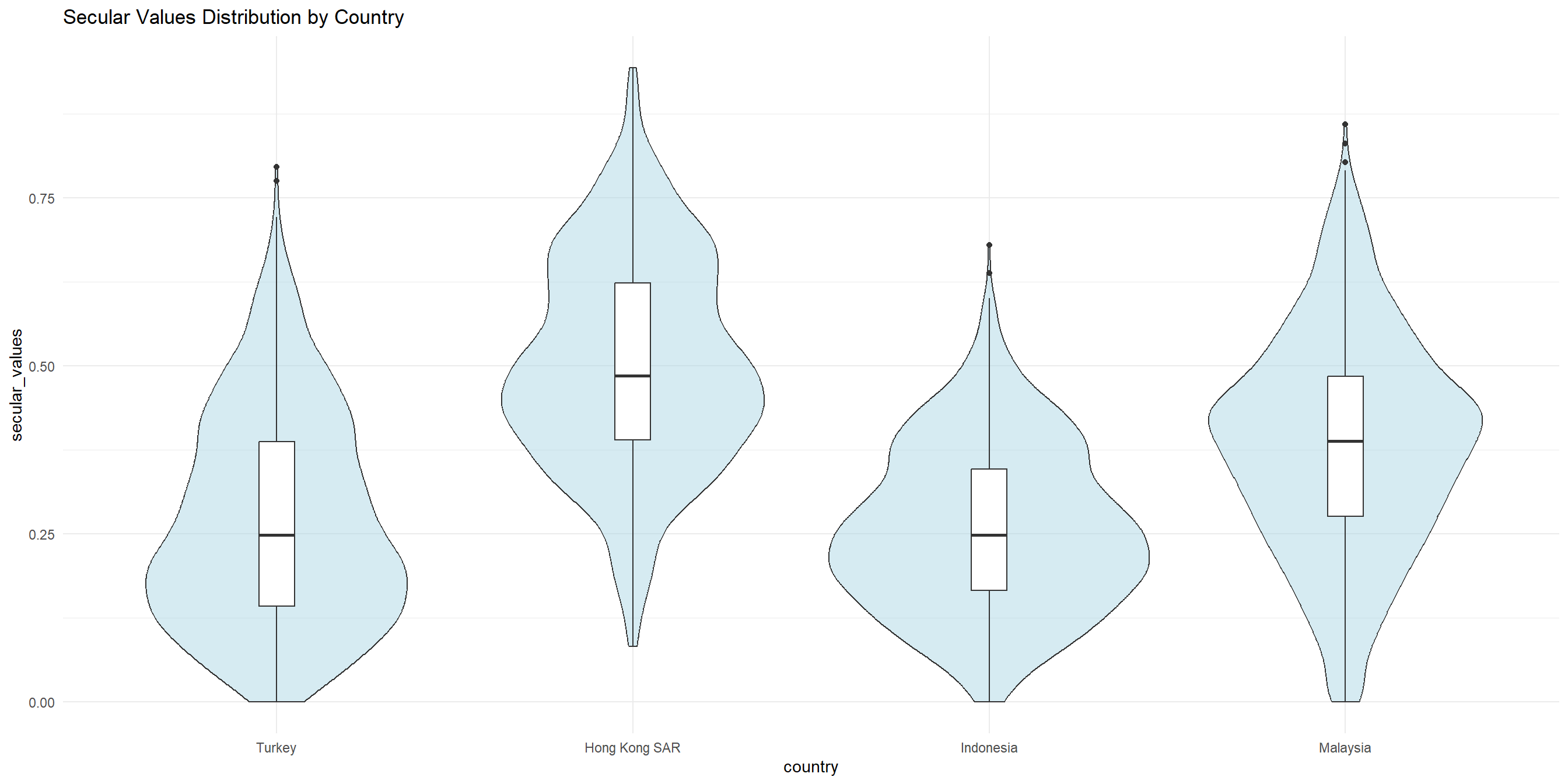
We could also layer our boxplots with violin plots to get a better sense of the distribution of each group.
One continuous, one categorical (cont’d) - Layered boxplots and violin plots
How to save your images - ggsave
There are two ways to do this:
Via
ggsaveThe point-and-click way in RStudio
Below is the ggsave way:
# save the chart into an object instead of viewing it like we have been doing
boxplot_obj <- wvs_cleaned |>
    ggplot(aes(x = age)) +
    geom_boxplot(fill = "lightblue", color = "navy") +
    labs(title = "Age distribution of respondents",
         x = "Age") +
    theme_minimal()

# pass the saved chart into ggsave and give it a filename
ggsave("fig-output/boxplot_1.jpg", boxplot_obj)
How to save your images - point-and-click
- Go to
plotstab at the right pane - Click on
Exportbutton. You can export the plot as image file, or as PDF. - Important: to keep your files organized, keep your exported images into the
fig-outputfolder that you’ve created in Session 1.
Using Facets for more complex visualization
Compare patterns across multiple subgroups
Identify interaction effects
Maintain visual clarity with complex relationships
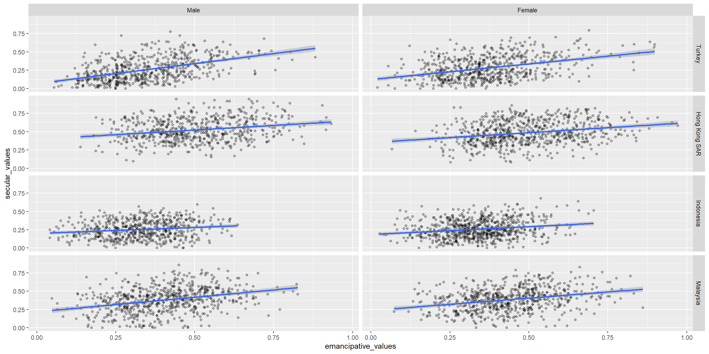
Facet grids are useful when we have more than two variables to visualize. However, if used excessively they may become too complex
Using Facets for more complex visualization
Is fancier = better?
Fancier, more complicated visualization does not necessarily mean better!
Take a look at this award-winning visualization by Simon Scarr

End of Session 3!
Remember the strategy:
- Have the ggplot documentation/cheatsheet open
- Decide on how many variables are involved. Is it just one? two? more than two?
- Determine whether the variables are categorical or continuous. If you have more than one, are they both categorical? one categorical + one continuous?
- Refer to the documentation to see which type of visualization would make sense for your variables.
Check out the R Graph gallery for inspiration and code samples!
Next session: inferential stats in R using WVS data
Quiz Time! (compulsory)
Scan the QR Code below to assess your understanding of basic R functions for data visualization and descriptive statistics, including summary statistics, ggplot2 syntax, and data plotting techniques. All questions are required and each is worth 1 mark.

Appendix
At home exercise #1
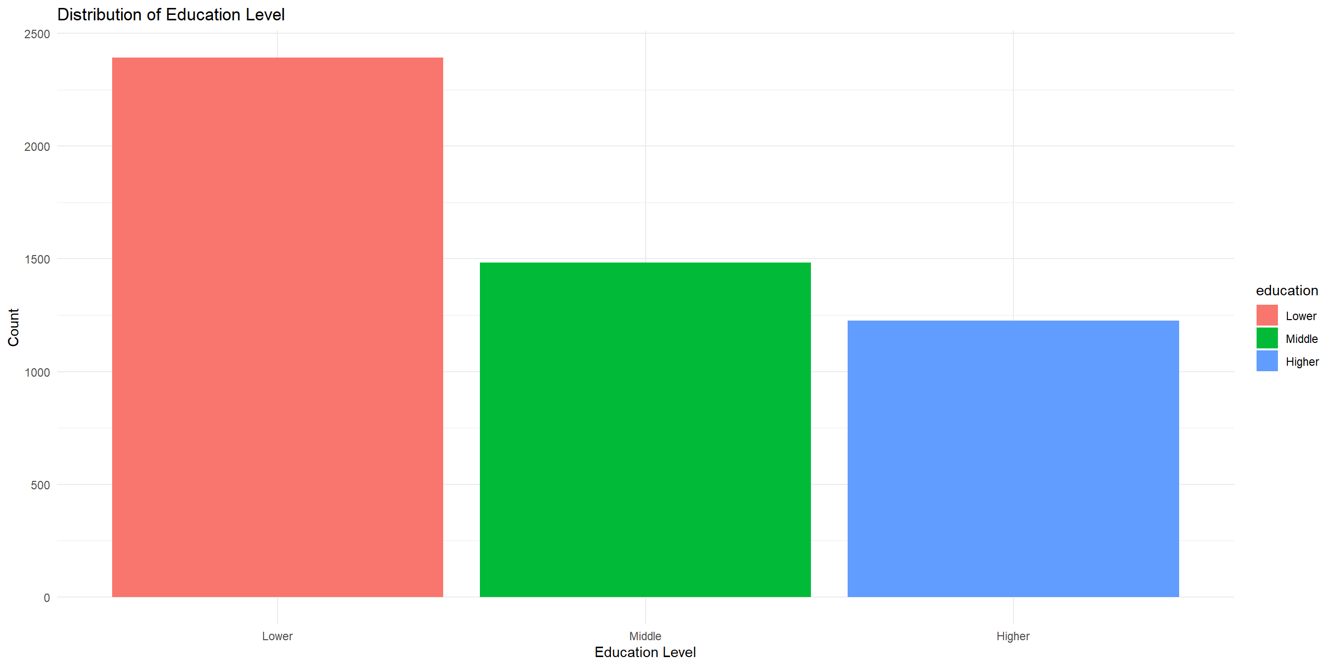
Create a barchart that visualizes the distribution of education
At home exercise #1
At home exercise #2
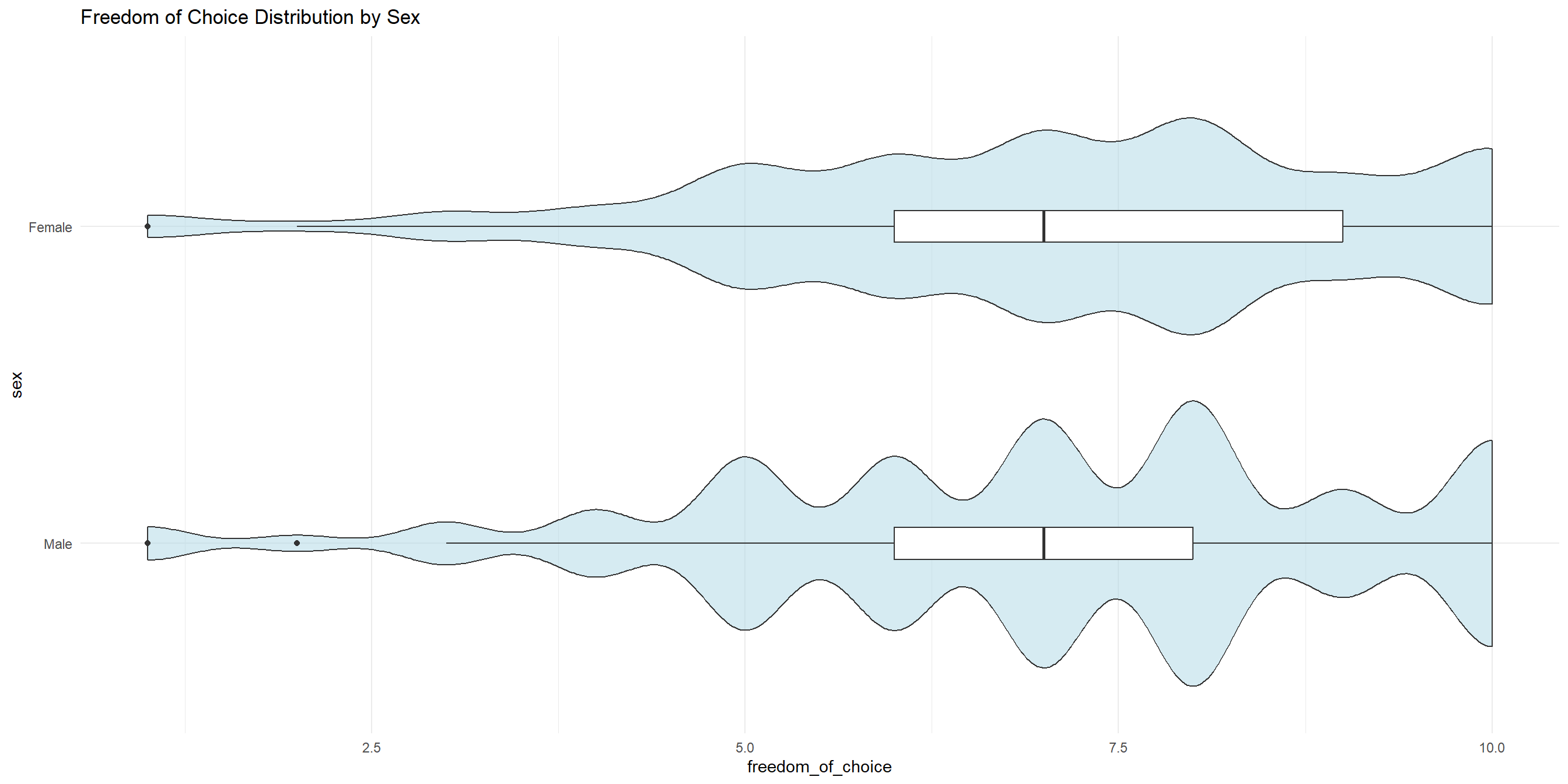
Create a side-by-side boxplots that visualizes freedom_of_choice for each sex.
At home exercise #2
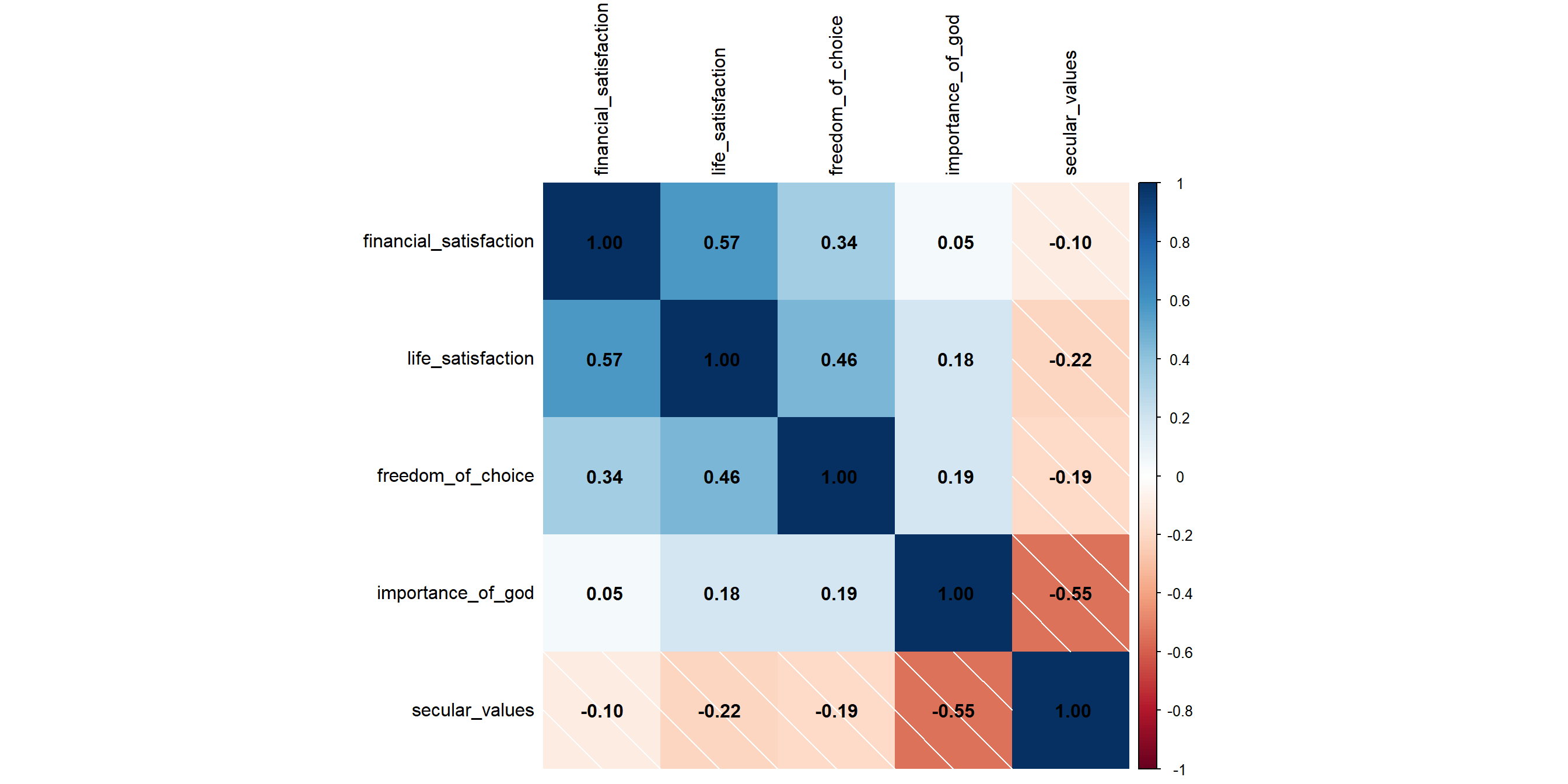
Correlation Plot
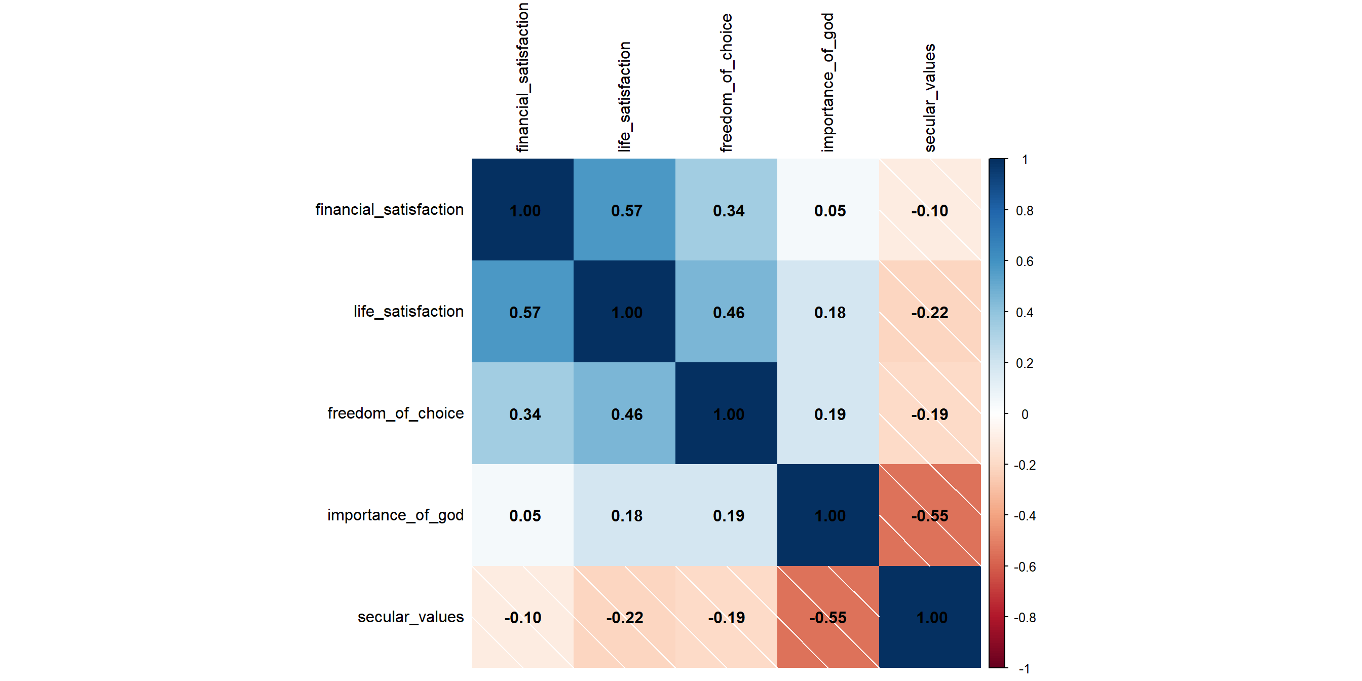
When there are more than two continuous variables to explore, correlation map is sometimes used. We can achieve this with ggplot, but it’s much easier to use the corrplot() function from the corrplot package.
Let’s visualize the correlation map for these five variables. Notice the mix of positive (red) and negative (blue) correlations — for example, importance_of_god and secular_values are strongly negatively correlated.
library(corrplot)

# select all the columns for correlation calculation, save it to columns_for_corr
columns_for_corr <- wvs_cleaned |>
  select(financial_satisfaction, life_satisfaction, freedom_of_choice, importance_of_god, secular_values)

# pass the columns_for_corr to cor() function, and save the result to cor_matrix
cor_matrix <- cor(columns_for_corr)

# visualize the cor_matrix with corrplot()!
corrplot(cor_matrix,
         method = "shade", # show the correlation strength as color shades
addCoef.col = "black", tl.col = "black") # label the coefficientsCorrelation Plot
Correlation Plot - shorter code
We can shorten the code in the previous slide using the maggritr pipe |> like so:
Refresher:
Notice that we don’t have to pass the column names to cor() and corrplot() function. This is because the maggritr pipe |>, acts as a “conveyor belt” that take output from one step and then immediately feed it to the next step.
Correlation Plot - shorter code